BRIEF

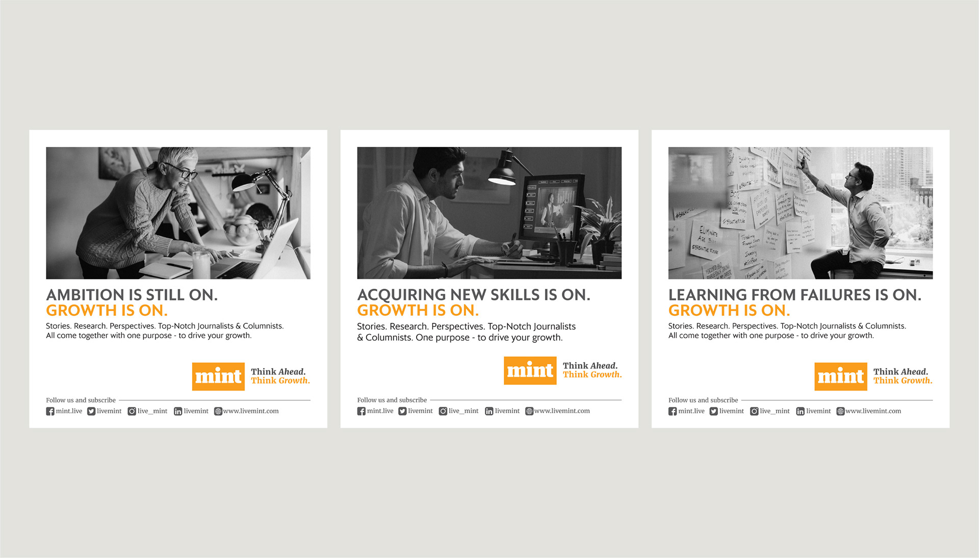
It was during COVID, when every brand was trying hard to stay relevant with time and situation. Mint was struggling to navigate its readers on their digital platform, while physical circulation of their newspaper had come to a complete stand still.

“Be the change you want to see.” became our approach for the brand.

IDEA

Mint became the symbol of change, by undergoing one itself. We dropped the gold mint in the logo and cleaned up the shadow. Their digital version would carry the word ‘LIVE’ in the logo unit. We made sure to knock that off and brought in a clean version of the logo that sat consistently  on both the platforms.

EXECUTION

Changing the logo wasn’t going to be enough. Changing the positioning was equally crucial. So we designed a campaign that connected with people at an individual and at a professional level.
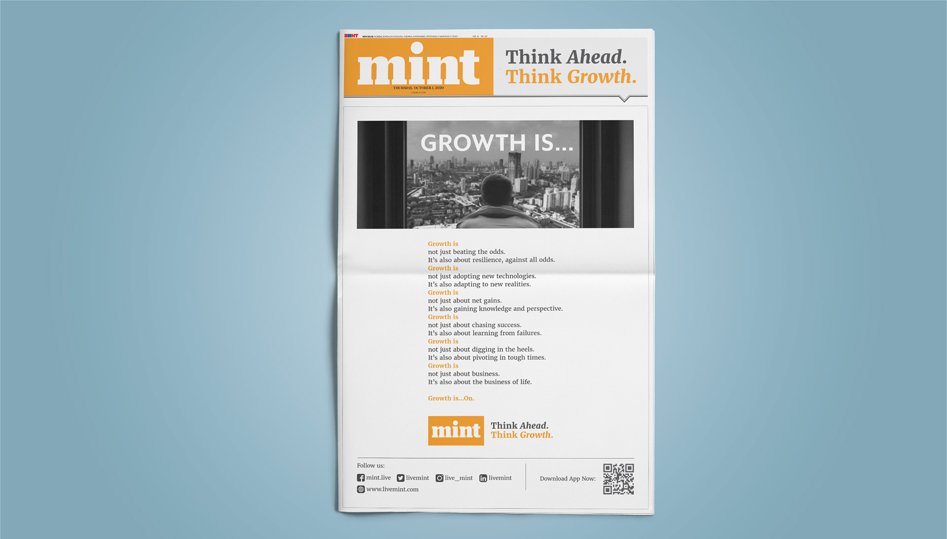
‘Think ahead. Think growth.’ became the chant, where the brand connected with the then mindset of people wanting to fight their way through the epidemic.

As extensions to this campaign, Mint also launched several digital activities like webinars, which helped people in reassess their strategies and course correct their way forward.


You may also like

121 Experiences
2017
Fluid brand identity system for a firm that specialises in to experience design
Breathless Films / Vinil Mathew
2014
Branding design for a film production house
Domino's X Dubai Expo 2020
2022
Campaign identity design for Domino's - An official pizza provider for the Dubai UAE Expo 2020.
Port-a-charge | Branding
2023
Society Spice Secrets
2019
Brand identity, packaging and communication design for Spice Secrets by Society Tea
Multifab | Rebranding
2025
Rebranding project for a manufacturer, designer and fabricator of coded pressure vessels, chemicals process plants and equipments for the Chemical Process Industry with a legacy of 40 years. On the occasion of turning 40, they wanted to refresh their entire identity system.
The Coforge Public Library | Visual Identity Design
2025
Visual identity system design for a public library. The bold and minimal design approach helps make the place look cooler and much desirable for the young audience today who are barely interacting with the books.
K's Verandah | Restaurant
2019
This is a project to develop a brand identity for a modern multi-cuisine restaurant that is inspired by and rooted in culture and tradition. The idea was to have a visual identity and a brand language that clearly spoke to the local customer base about the nostalgia and familiarity of their own culture. Presented here is a detailed process of an identity for this brand was developed and executed.
Coforge Technologies | Rebranding
2023
Premier Futsal 2016
2016
Brand identity system design for Premier Futsal
Back to Top