Freyn Pharma wanted to overcome their biggest challenge before expanding their product portfolio in the highly competitive pharmaceutical market - Poor brand recall.
Refreshing their brand and visual identity would allow them to build a strong connection with their customers, current and the potential ones. The new identity would also enable a clean start for the brand.
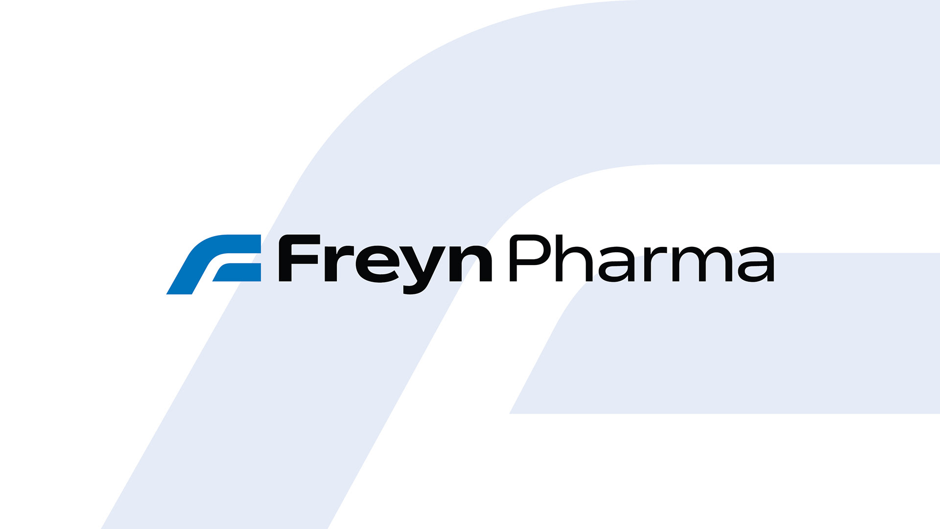
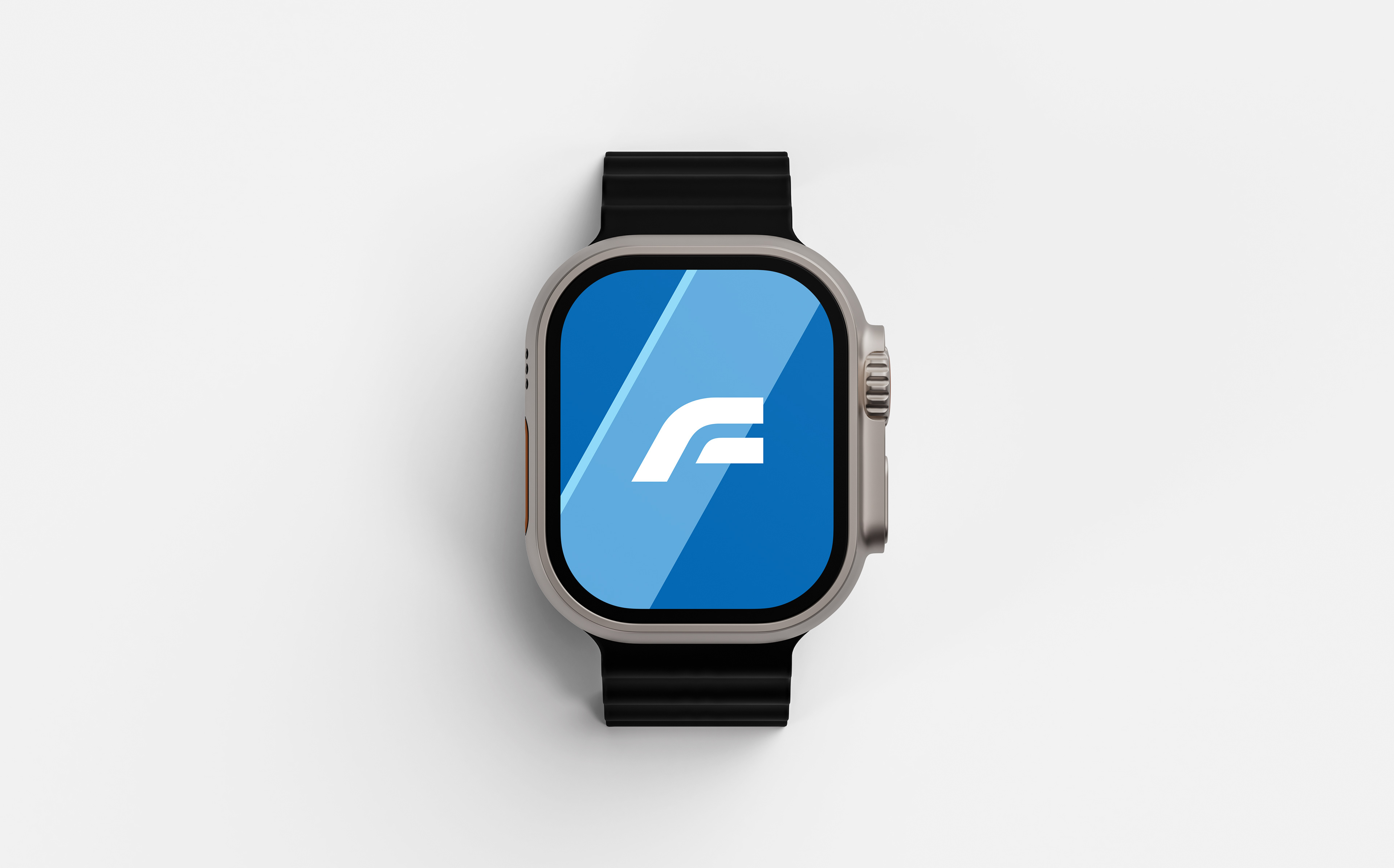
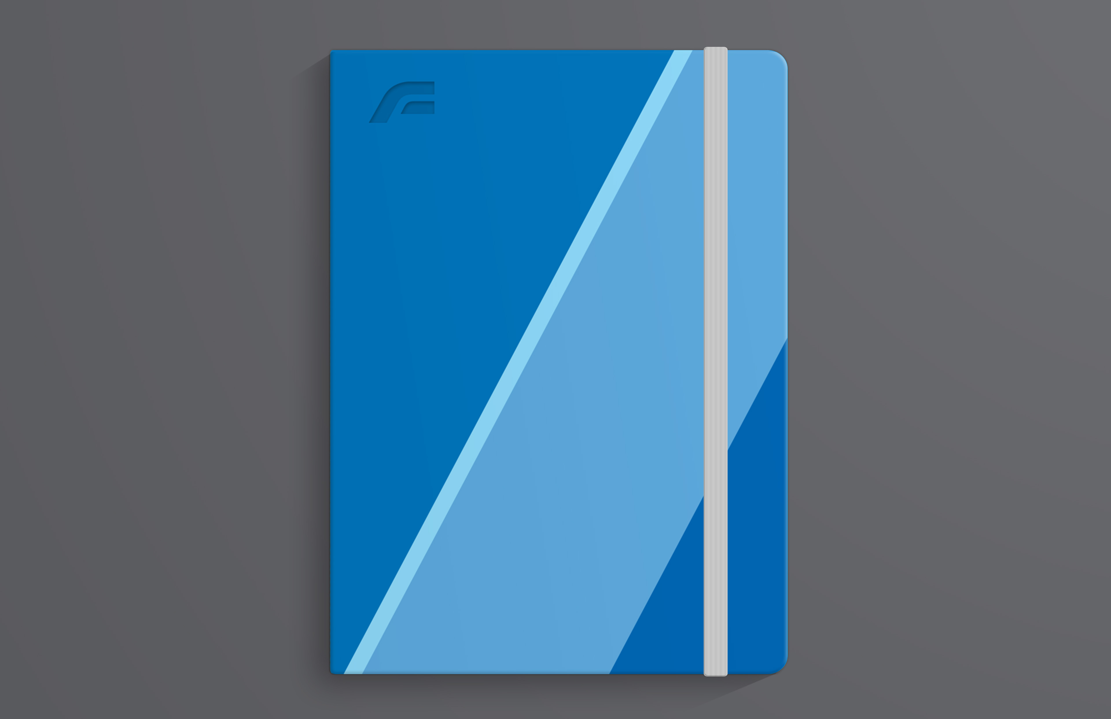
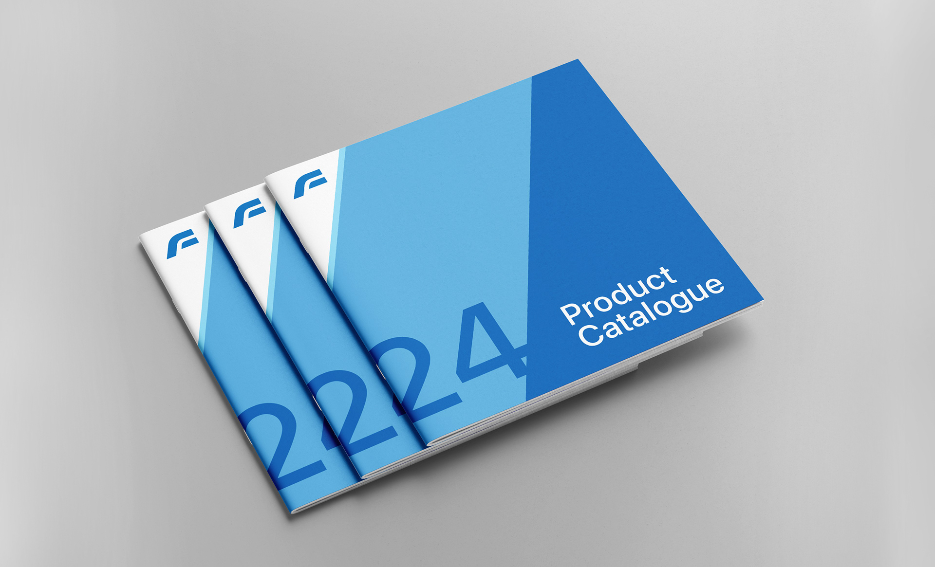
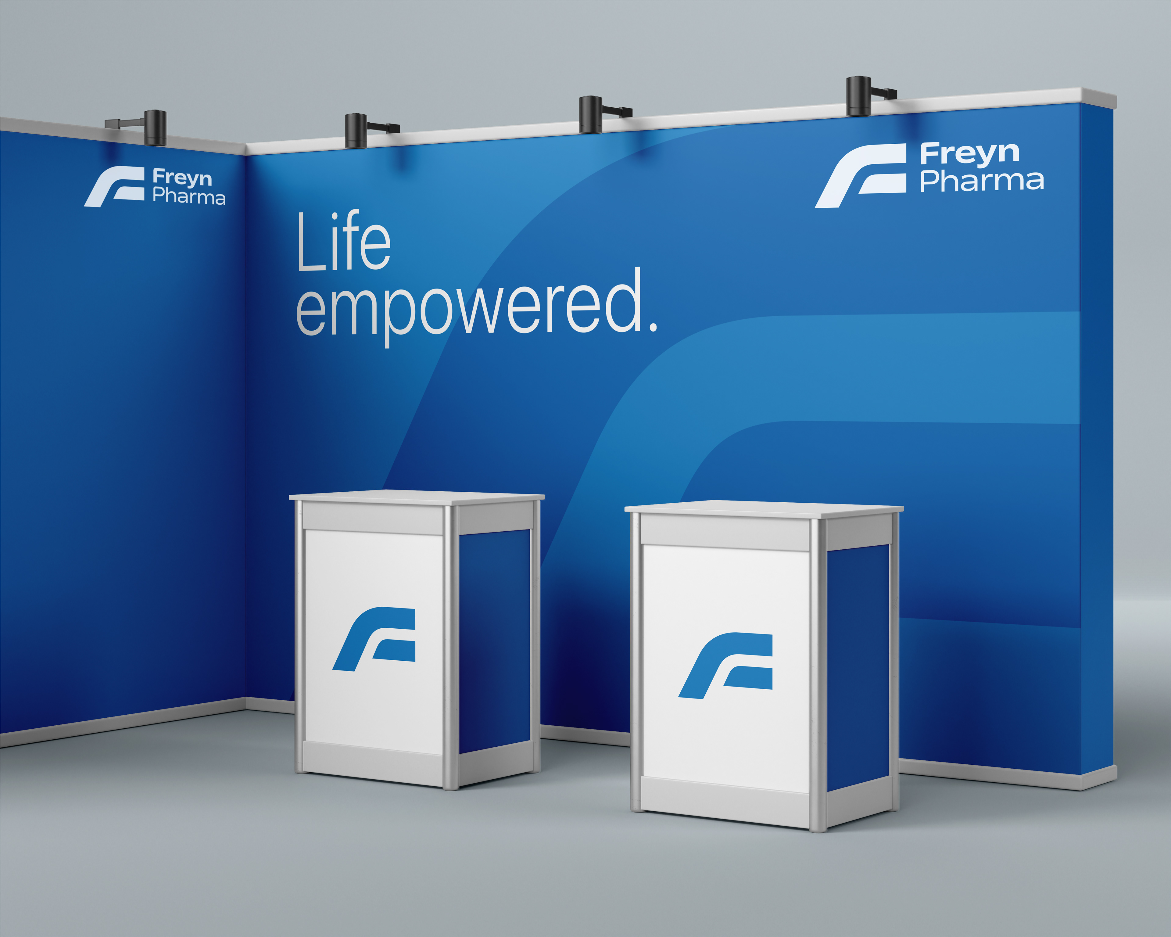
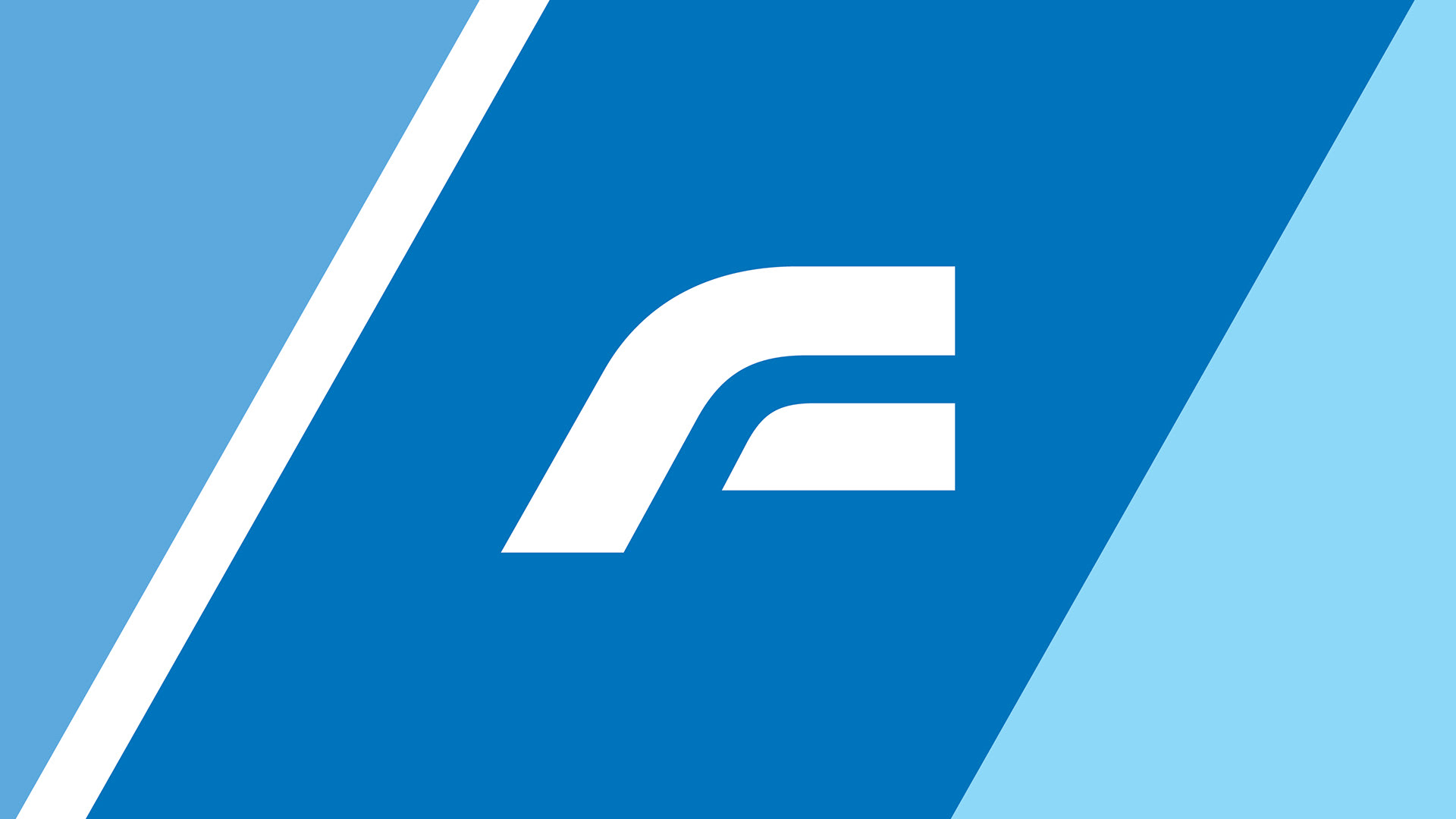
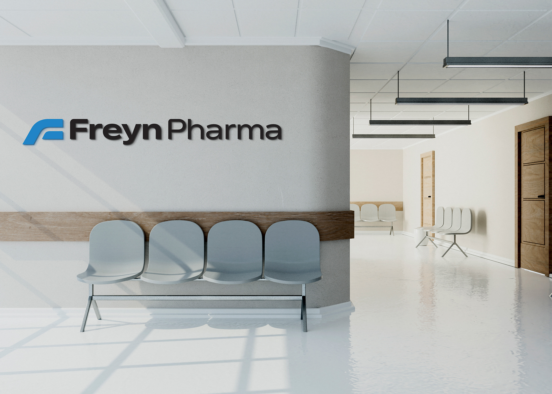
The brand mark takes a very simplistic approach that enables Freyn Pharma to grow from a start-up into a full fledged industry player. Its forward inclined structure indicates growth and agility.
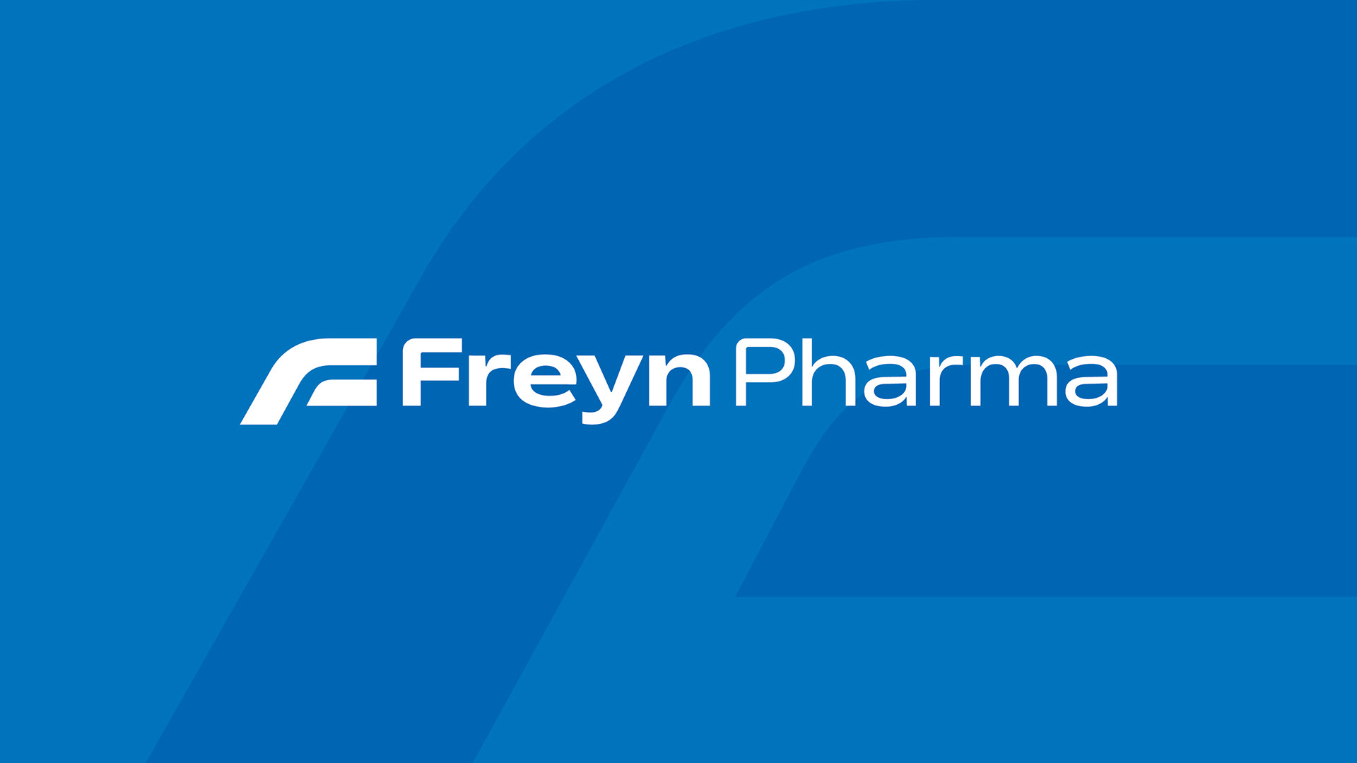
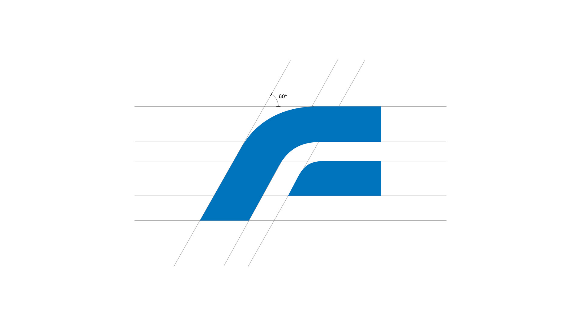
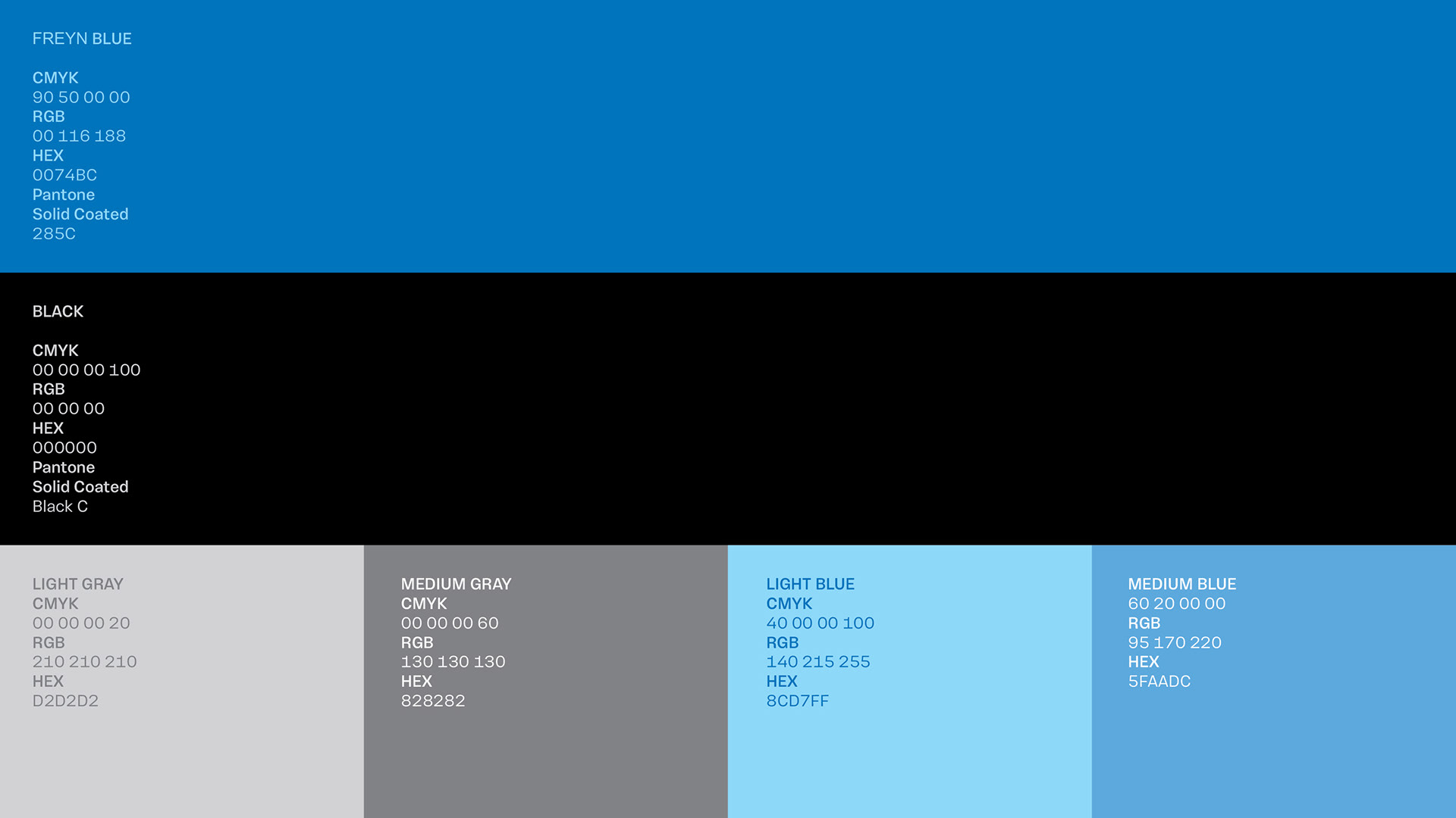
The soothing colour palette helps ensure its consumers about the quality of healthcare the brand plans to offer. The simplicity of the mark lends itself a dynamic visual language which is pretty much in sync with the core culture of the brand.


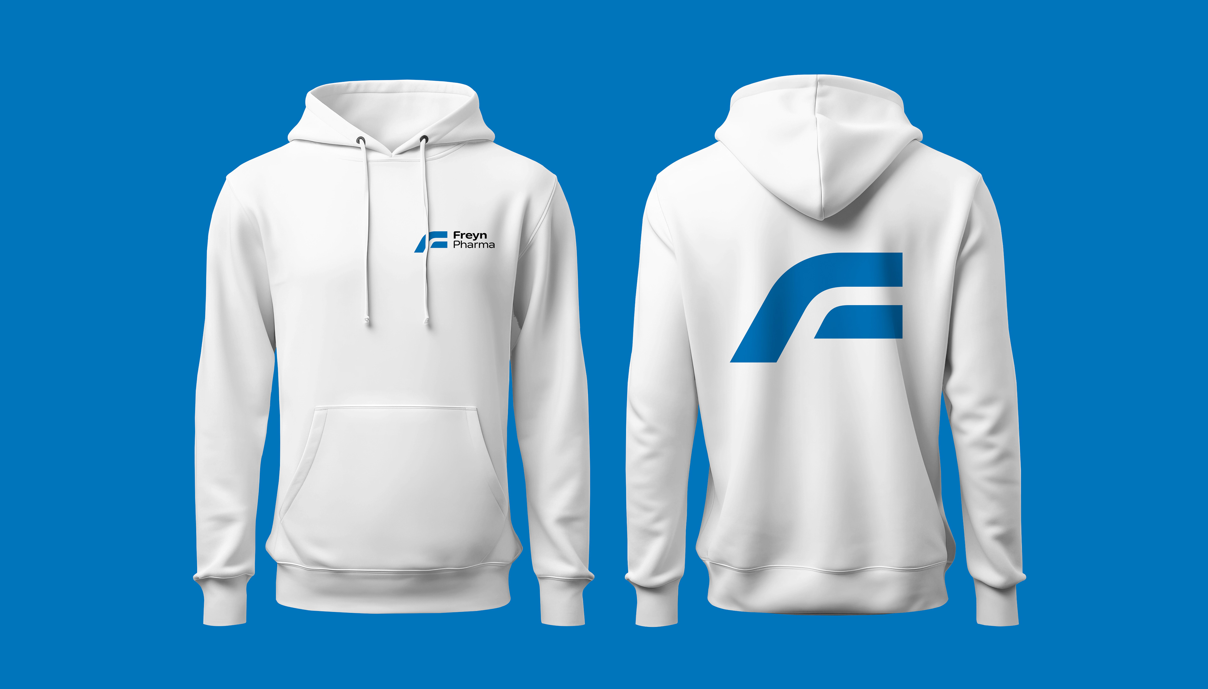

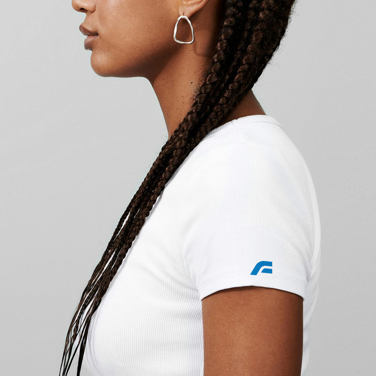
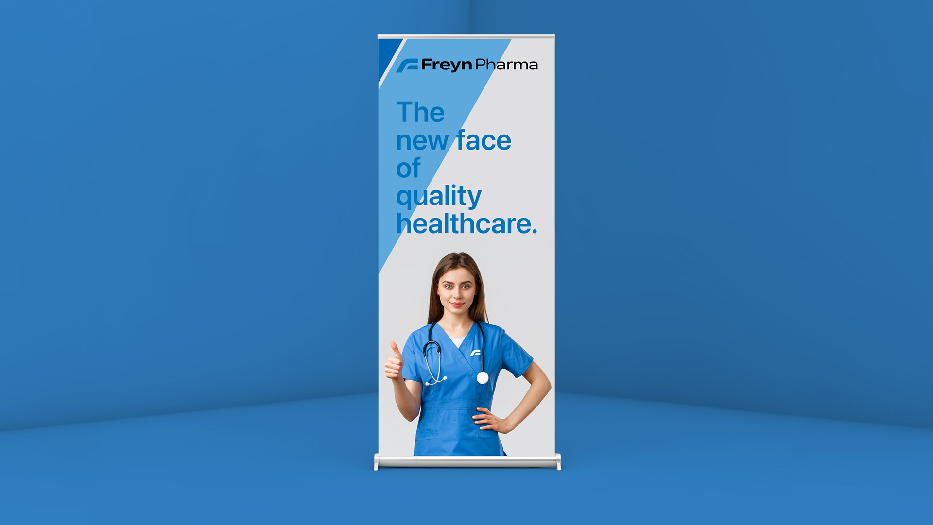
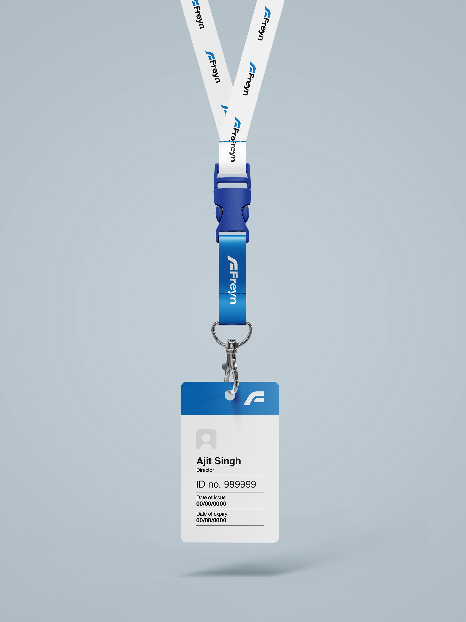
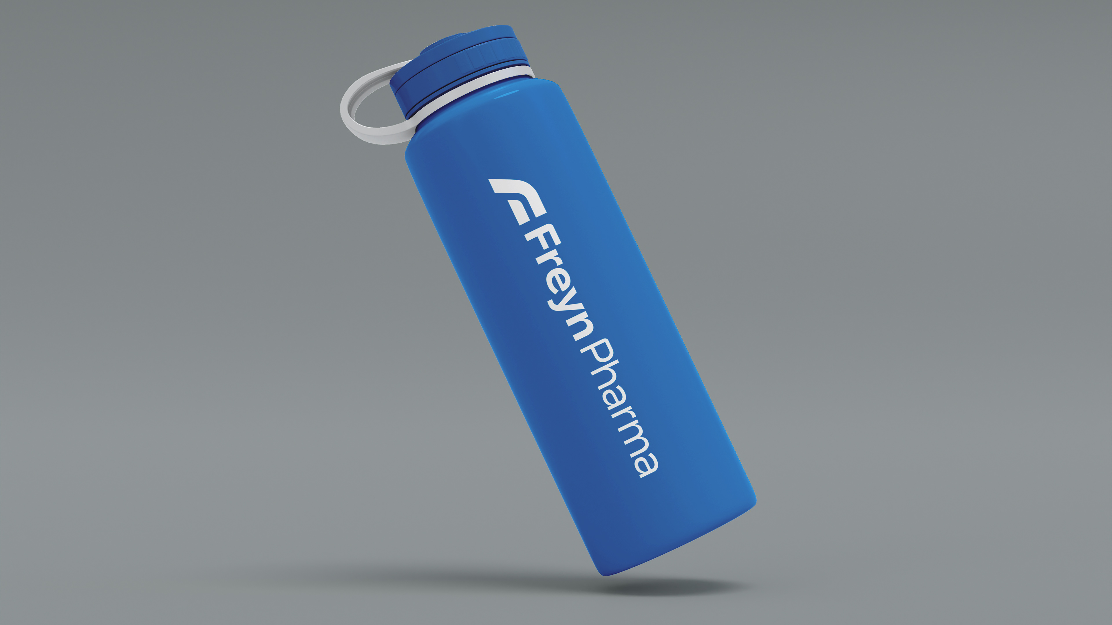
Strong visual consistency across various touch points brings a nice synergy for the brand.